Log in & Sign up Experience on AppDirect
Just as you wouldn’t want the front door of your home to give guests a bad first impression, we would like our users (who white label our platform) to be able to present their customers with a delightful log in and sign up experience.
A poor log in experience is like an ugly front door
This project originated out of a simple user request for an API to allow them to customize our account activation page (which was about 10 years old). I was brought in to consult on any design details and ended up spearheading a full redesign of all of our end user account pages. We decided that they should have more consistent and attractive UI, be easily customizable, encourage secure passwords, and be mobile-friendly.
I worked closely with the accounts/security product manager and one front-end developer. We developed the following criteria for the redesign project:
All account log in & sign up pages must:
Prioritize security
Be consistent with each other and with the latest product UI
Be customizable for a better white labeled experience
Be designed mobile first
Log in
I started with the log in page because it is the simplest— just two input fields, a couple links and a button. This allowed me to work out any new UI patterns and figure out with my UX team how much I could stretch our design system to meet my UI hopes and dreams.
Comparing the UI of other enterprise Saas log in pages helped me see common patterns and what I did/didn’t like about them.
I did a competitive analysis of the log in and sign up flows of 30+ enterprise tech companies. It was fascinating to see how such simple forms could have so many subtle differences. You can see some of the UI patterns I was tracking in the table below.
My goal in this research was to think of all the ways in which our customers might want their “front door” to be customizable. They were users of some of these enterprise products so it was important that we made them feel like a best in class product.
The final design for the log in page was a simple card with a logo and the essential links. The card design was mobile-friendly and required minimal work to code for different screens sizes (this was critical because I only had 1 frontend dev on my team). The log in button color is customizable as well as the background that it lives on top of.
Change your password
Because resetting a password is a ubiquitous action in technology, most people are pretty opinionated on the topic. I did extensive online research and got feedback from folks in all departments of AppDirect. Here were some of the questions we debated and tested and the conclusions we came to:
Should a user have to enter their old password when reseting it?
Yes. Despite having just entered their old password to access this screen, the users I tested the “new, new” password entry form on frequently entered their old password in the first field simply out of habit. People didn’t read the labels.
Should the password be unmasked while it’s being entered?
Yes on mobile. No on desktop. A mobile screen is small (unlikely to have lookiloos) and typing is error-prone, therefore it makes sense to show the password to ease the painful experience of typing a complex password. However, for desktop we wanted to prioritize security, especially as a white labeled enterprise software product.
Should the user be allowed to create a “weak” password?
Yes. The most significant security improvement of my new designs was a password strength meter. It was built to judge the “guessability” of a password and would rate it based on the number of guesses it took the computer to figure it out. As long as a password met the complexity requirements (i.e. contains an uppercase letter), we decided that it was okay to be weak because it was a conscious user decision and alas, freewill does still exist.
Should a user have to enter their new password twice?
Yes. Although double password entry is redundant, ensuring that you enter your password correctly is a top security priority and is worth the extra effort. It would be much more of a pain to have to reset your incorrectly entered password than to just type it twice. See comparison below.
Choosing which fields to include on the Change Password page was a hotly debated topic. We ultimately chose the widely used "current, new, new” flow.
Sign up flow
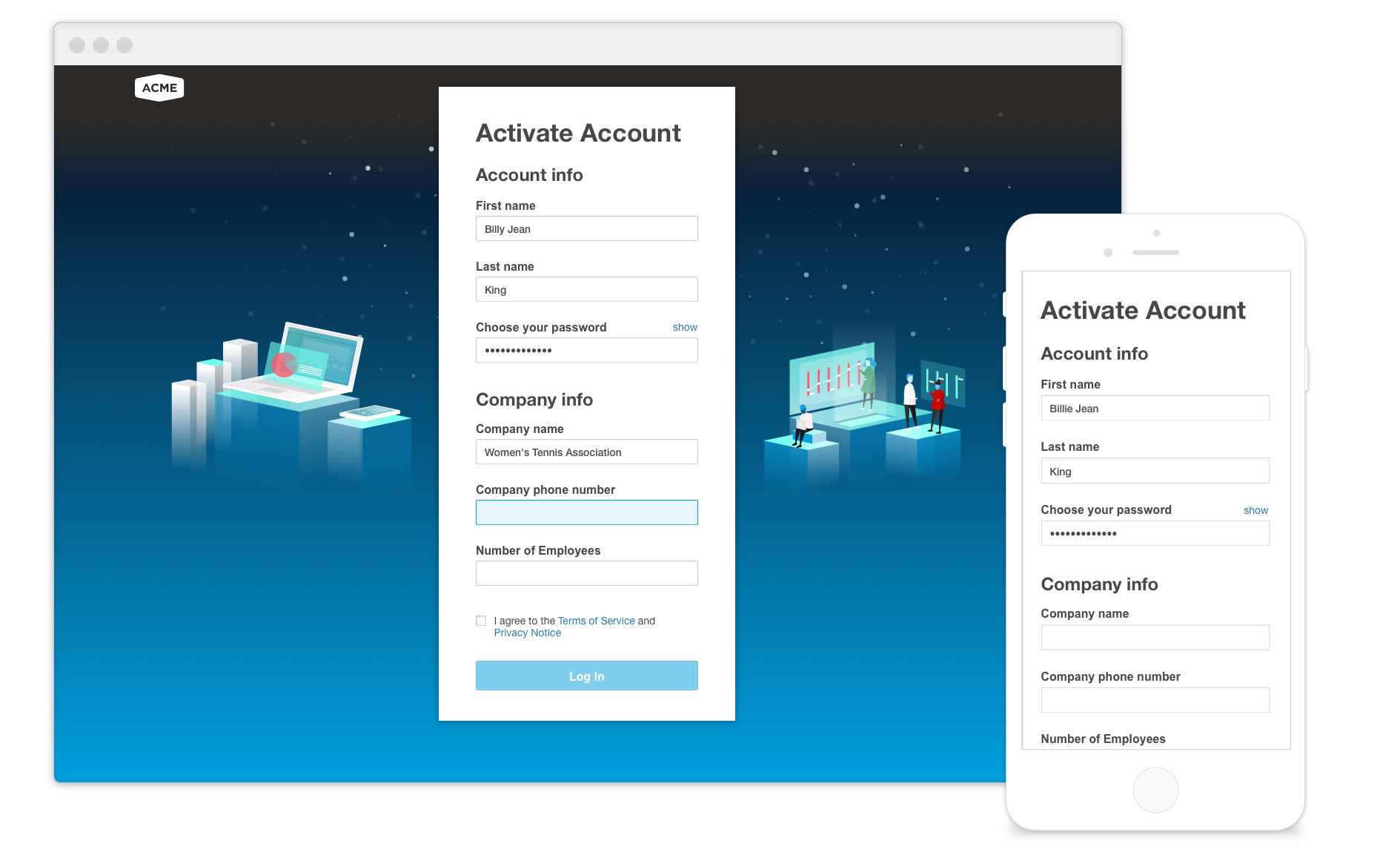
The sign up and account activation flow was the most complex of the screens, but by the time I reached it, I had already established my UI patterns and was confident that I wanted this longer form to follow suite.


